With the recent talk about number of bits/grays that should be sent to the printer drivers,
I figured I ought to try and find out and show some evidence of what's needed and can be seen on
a print. Just not being able to show a difference between 8 bit and 16 bit is unsatisfying. So I
thought trying fewer bits to find where the difference really is might be more informative.
The prints are all made on an R2400 with Epson K3 inks and QTR software, EEM 50/50 warm/cool profiles.
The results are pretty surprising.
Rather than using a "real" image that is unknown I've used a newly created full 16-bit, 360ppi
21step wedge. It's just a 16 bit grayscale gradient plus the 21 step posterized lower section.
A very key aspect of the exercise is the algorithm that Photoshop uses in conversions from
16-bit to 8-bit files. The "noise" added by PS has been discussed here before but this is
not some random noise added to smooth over the transitions. It's intelligent dithering
that can represent intermediate values very well. This same method is used in the Color
Management Engines if you select "Dither 8-bit images" in Color Settings. It's also what QTR
uses to convert 16-bit to 8-bit.
It's pretty easy to take advantage of PS's conversion for any number of bits/levels. It can
be used for any image, here's how:
1) Set Image > Mode to 16-bit -- it's OK if the original is 8-bit
2) Run Image > Adjustment Levels, set the Output Levels to how many levels you want. E.g. for
64 levels I used 101 to 164. It's best to avoid the end points 0 and 255.
The image will of course be very gray since you compress it all into a small range.
3) Set Image > Mode to 8-bit
4) Run Image > Adjustment Levels, to undo the compression you did above. Now you set the Input Levels
to exactly the same as you had above for the Output Levels. This expands the range back to
the full amount.
That's it. Check out the Histogram to see the number of levels.
I did this on the 16-bit 21 step and printed it out for 8, 7, 6, 5, 4, 3 bits to see the
extremes. Here's the test file:
http://harrington.com/bittest8.tif
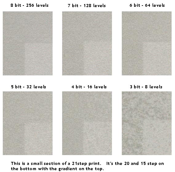
I scanned the results, here's a 1000dpi scan of the 15 and 20 step values.
The scan is more detailed than you will see with the naked eye and even with a loupe.
http://harrington.com/bitpost.jpg
Here's what I see in reverse order.
3 bits, 8 levels of gray jumps out at you -- it's very noticeably grainy and blotchy.
4 bits, 16 levels isn't bad but once you pay attention you can see the difference.
5 bits, 32 levels is very difficult to see any difference, it takes a loupe and some
imagination. I doubt anyone could do a blind A/B test and do better than guessing.
6, 7, and 8 bits are all appear identical as far as I can tell.
My conclusion is that 8-bits going to the print driver has plenty of data and sufficient
headroom to not be an issue. I think the most significant issue these days is the
number and densities of the inks used. It's important how all ink densities and hues
work together to make all the gray values. Naturally the software must give sufficient
control to use the inks in the most intelligent way. Probably the K7 inks are overkill
but give the most headroom for getting smooth prints. What you give up is control of
hue on a print-by-print basis. Most of the other inksets allow the possibility of hue
control or even full color but give up some of the headroom for smoothness. It's a
tradeoff.
I should emphasize that none of this is meant to support using 8-bit files for editing.
For grayscale work I advocate 16-bit throughout the editing workflow. The 8-bit dither
of Photoshop is a one-shot feature, only right before printing. None of the editing
commands use this.
Roy Harrington